Adaptive Web Design : Web Scaling
Develop for low end devices and keep adding high end ones to serve everyone!
Introduction :
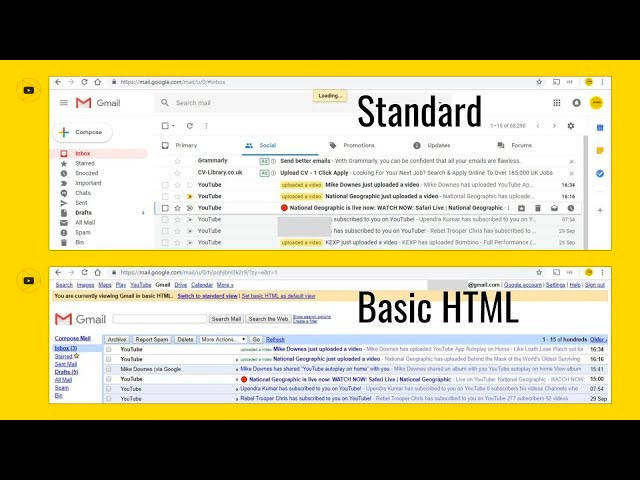
Have ever observed that youtube automatically switches to lower resolution based on network strength , You might have already observed that few of websites like amazon or facebook etc kind websites used to have m.domain.com loaded in mobile browser and domain.com in desktop. I remember gmail used to have a option Load basic HTML (for slow connections) written at bottom of page.
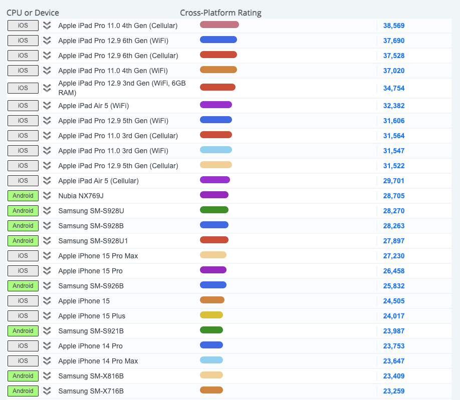
The way people access internet has changed dramatically in recent years, most people are using mobiles ( especially in India), and if we just type “Which mobile is best for playing Call of Duty” we would be having 1000s of influencers reviewing with benchmarks and all in different price points. We can see that there is a huge performance gap between devices users has (we can see image below of frequently used devices benchmark). If it is case of web apps, the internet network strength plays key role in determining the performance of website too. So in order to make our web app accessible to the larger scale we need to respect the hardware device and network of our users.
screen shot from cpubenchmark.net
What is Adaptive Web Design?
Adaptive web design is a strategy that involves designing a website to adapt its layout and functionality to suit the device, network, browser, and screen resolution of the user. It ensures that our website provides an optimal user experience across a wide range of devices and browsing contexts.
Basically we make a websites that has its core actions like navigation , visually appealing and performs well regardless of device or network, so that user can perform their basic things. For example , if we are stuck in a road in middle of night at hill station, at that time if google maps takes time to load with all the animations and near by restaurants images , we would be so angry and we ideally prefer to just show a arrow to get sort the direction where to take left or right, right!
Pros of Adaptive Web Design
Improved User experience and user retention by preventing problems that could drive users away
Faster page loads which might help in improving SEO along with decrease in user’s wait time.
User can choose to save data effectively
Easier maintenance and error tracking.
Provides enough Data by (setting up analytics) which helps in prioritisation and optimisation according to traffic and network users use most.
Switch between resolutions and decrease server load based on headers
Plan and add progressively high end features according to user’s network and device.
Cons of Adaptive Web Design
There might be effect on SEO ranking of the website due to duplicated content is not handled properly.
It takes extra cost to implement as it requires more developers to code and maintain multiple versions.
{Adaptive Vs. Responsive} Web Design
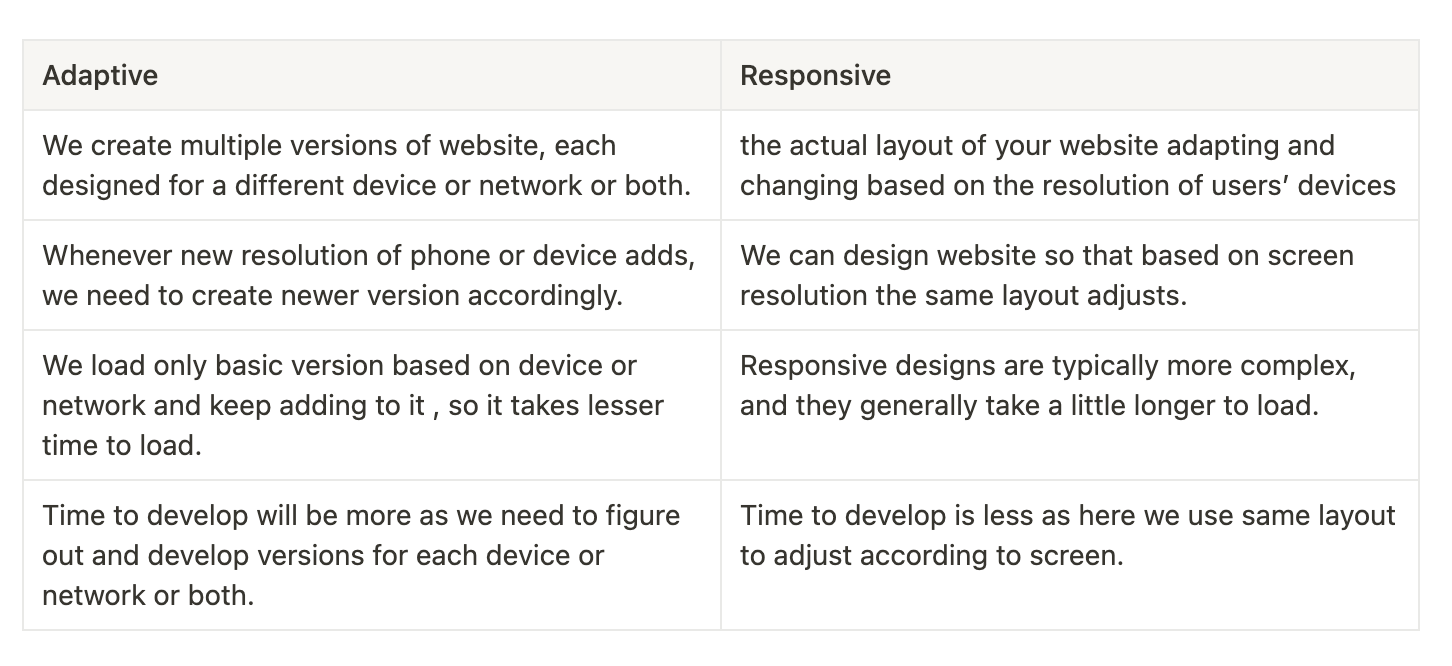
There are 2 ways we can build websites so that they work with various screen sizes and devices: adaptive or responsive web design.Both adaptive and responsive design play an important role in improving user experience in their own ways.
Simple terms , adaptive is like having different dresses for different occasions and responsive is like having flexible hoodies that can adjust to different body sizes , so you and your brother can wear it peacefully.
image from Interaction Design Foundation.
How to achieve it
There are few APIs provided by browser to help in achieving this
a) Estimating Network Strength :
navigator.connection is network information API provided by browser which has information about network connection , it helps to identify low network or data saver preferences.
Reference from web.dev
Ref : https://googlechrome.github.io/samples/network-information/
b) Estimating Memory :
navigator.deviceMemory is another device information which gives device memory in gigabytes in nearest power of 2 ,it helps to identify low-end devices.
c) Estimating CPU Power :
navigator.hardwareConcurrency gives information about number of logical processers available to user agent. it helps to identify cpu power and plan using intensive logics accordingly so it wont stuck to user (especially 3D or gaming sites)
BTW, always check for Browser Support, before planning !!!
screen shot from https://caniuse.com/?search=navigator.connection
Which websites does this ?
Twitter has “Data Saver Mode” which loads blurred or low resolution images
Youtube High Resolution to low Resolution shift on low network.
Amazon has different set of navigational items for different devices
Conclusion
For starters, responsive design is good and takes lesser time to implement but if we are scaling up and our website has lot of traffic, that means we are reaching lots of device types and network strengths , so we have to plan in moving to adaptive design.Simply, We cannot deliver same experience to every user , but we could make core experience for all users.
References :
https://web.dev/articles/adaptive-serving-based-on-network-quality
https://medium.com/zolo-engineering/adaptive-web-applications-with-react-redux-d3dfcdf2cee8


